→ sopro jewellery
Art direction / Design System / Graphic Design / Visual Identity / Package
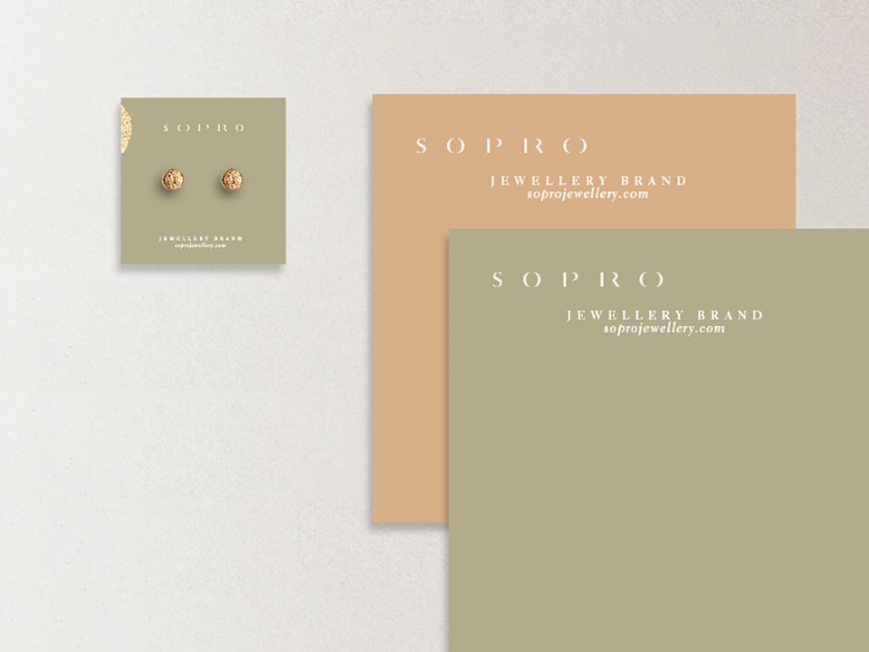
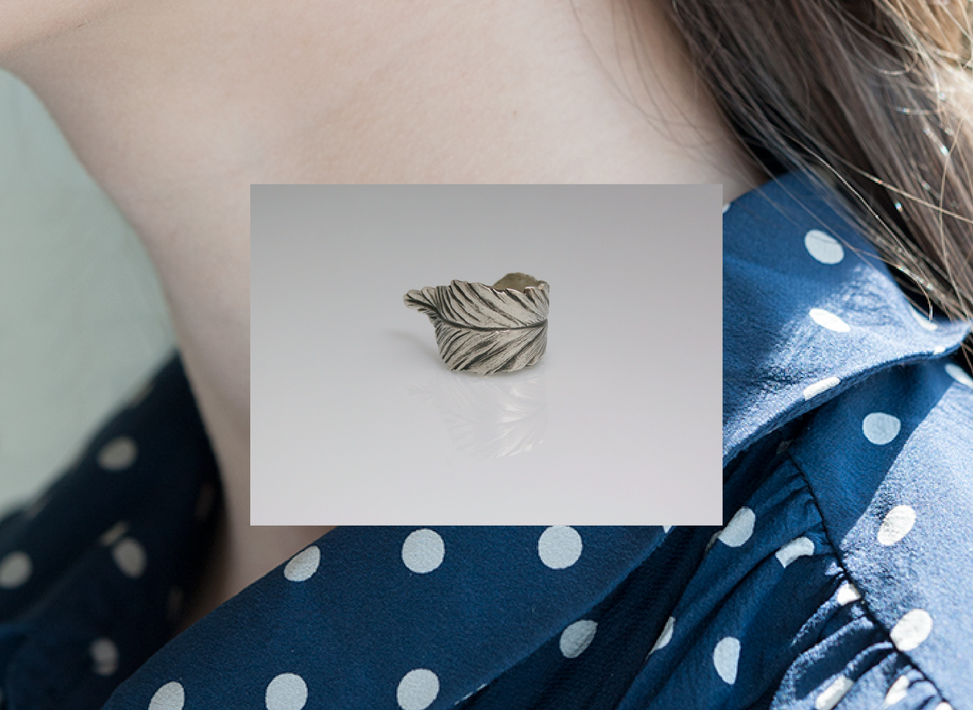
Sopro ("blow") is a lifestyle brand that offers informal and casual jewellery pieces.
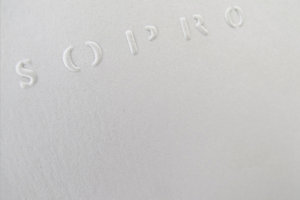
Sopro means blowing, in that way the identity is presented as a "typographic breath". It is a changeable logo where both kerning and negative letter space compress and extend.
YEAR: 2016-2017
