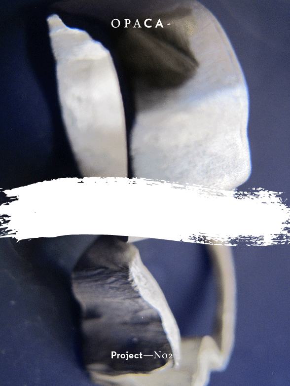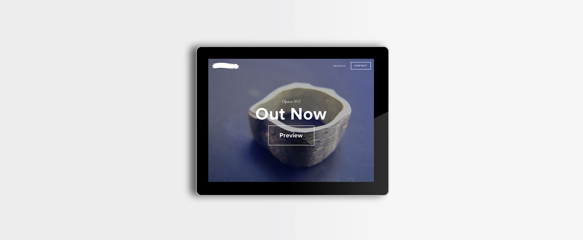
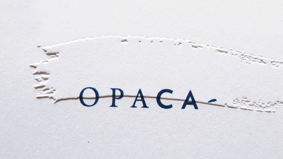
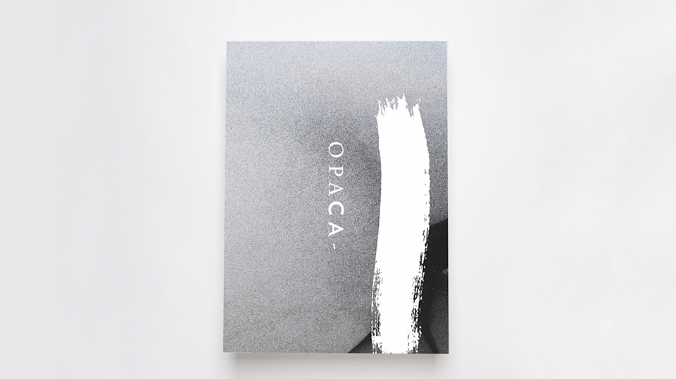
→ opaca
Art direction / Design System / Graphic Design / Visual Identity / Web Design / Editorial Design
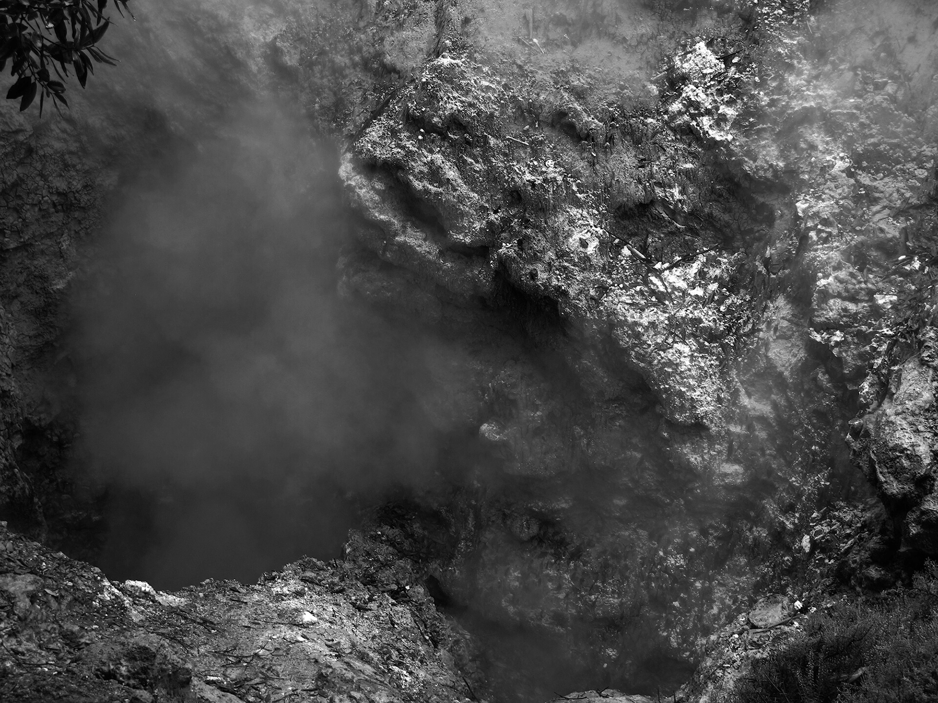
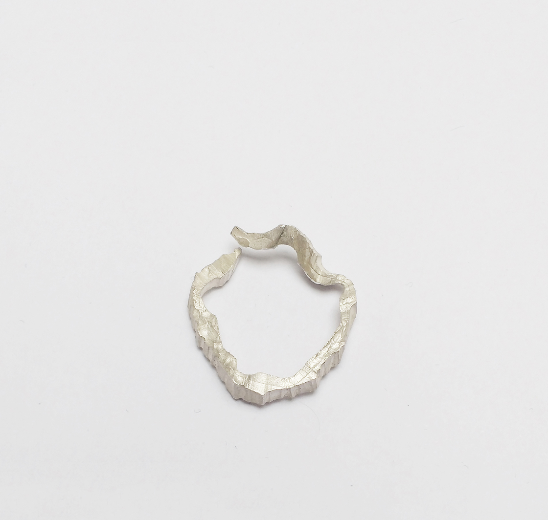
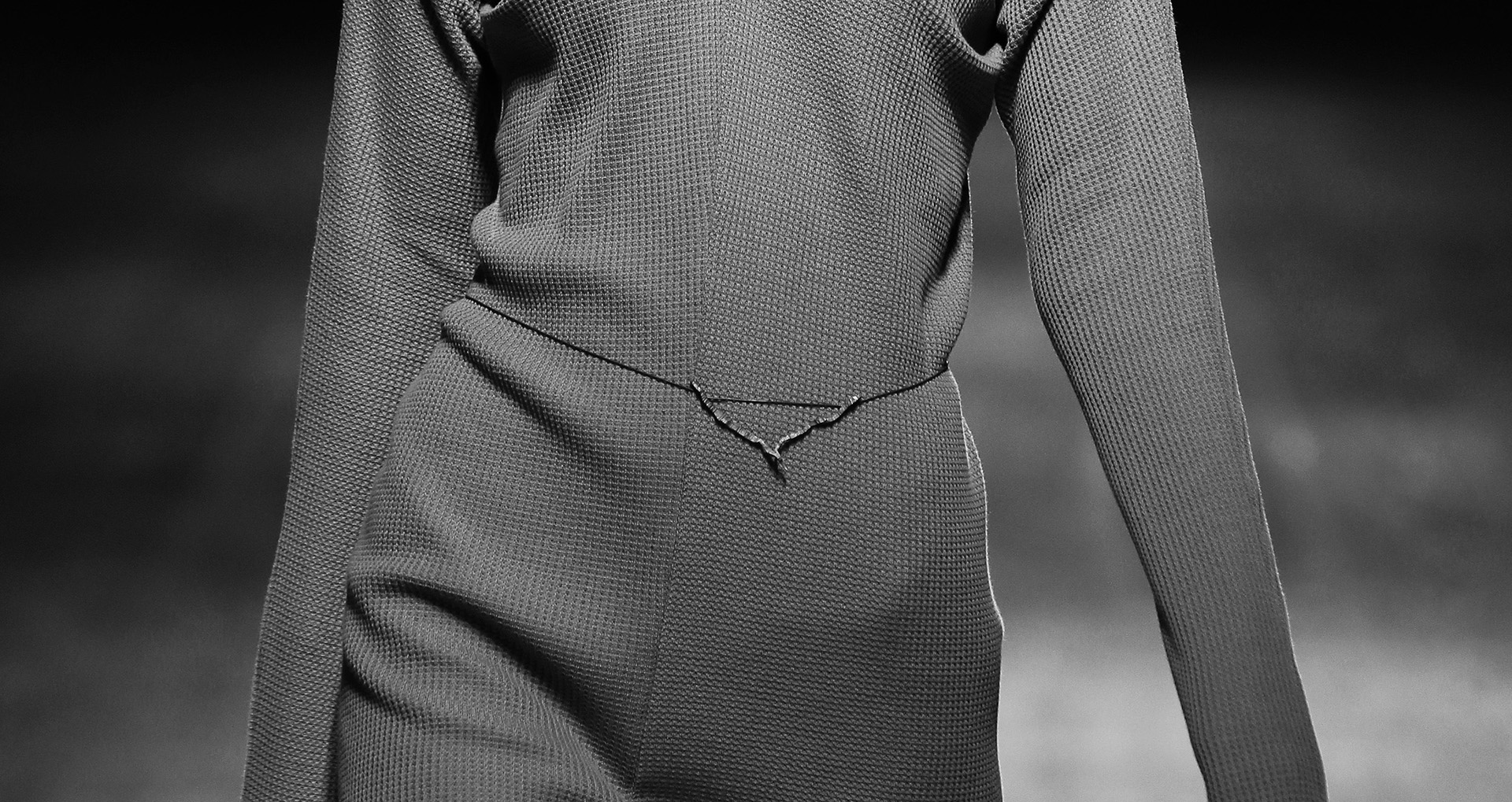
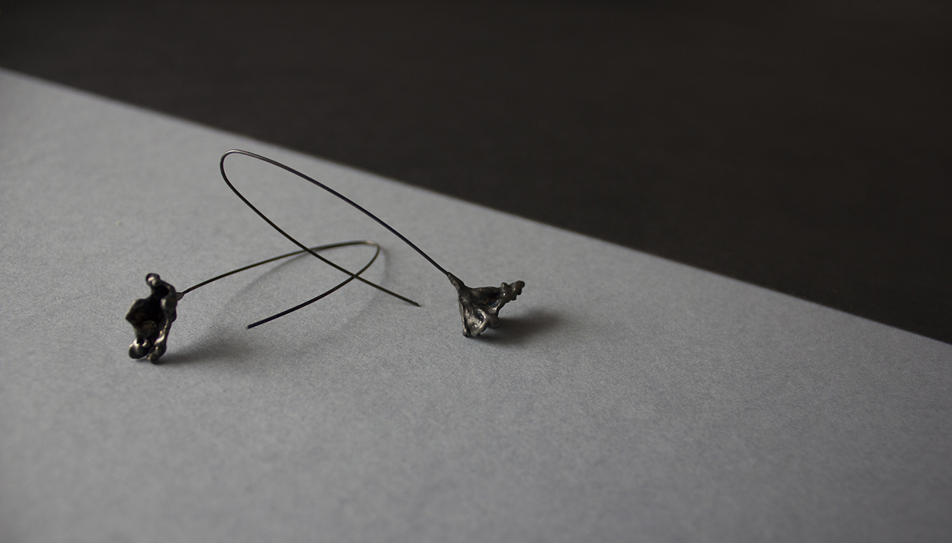
Opaca shows a set of projects that address jewellery in an experimental way. It presents small jewellery series alongside with inspirations and objects that come across the process of making.
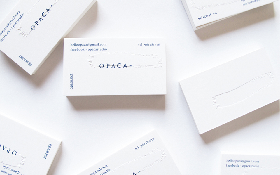
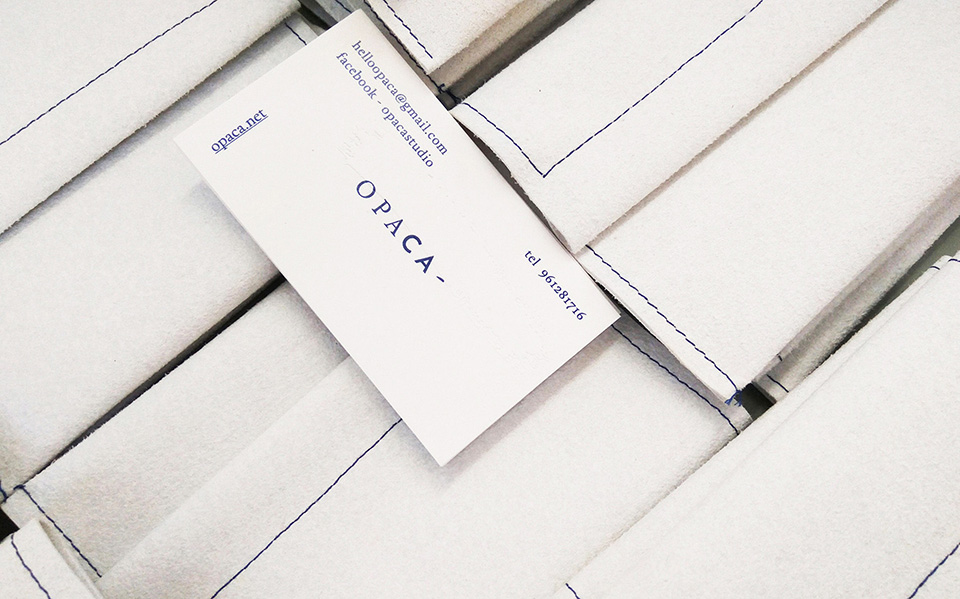
Opaca intends to blur the line between ornament and experience and also between who uses the object and who sees it. Following this, it was developed a graphic language that expresses this duality. There were put together two different typographic styles, embracing delicacy and roughness.
The brand proposal adapts itself, it is presented as a work in progress. It is used a brush flick as a secondary graphic element that aims to detach us from the classic concept of jewellery and connect us with the materiality and multi-possibilities of this area.
YEAR: 2016